Agency Engine
What I did
Collaborated with AgencyEngine’s leadership to establish their brand identity, design system, and website direction. Produced market research, identity concepts, and a full Figma design system with components and guidelines to empower their in-house team.
Why it matters
Gave a new division of a company the tools to launch with confidence and consistency. By setting a clear design foundation early, AgencyEngine could focus on growth without losing cohesion in how they present themselves.
Role
Design Consultant
Client
Agency Engine Leadership
Services
Brand & Product Design
Areas
Strategy, Design, Research
Laying the Foundation
We started by grounding the project in discovery. I worked closely with Agency Engine’s leadership to understand their vision, audience, and the kind of presence they wanted to build. Through workshops and working sessions, we clarified their brand values and translated them into visual principles that would guide every design decision moving forward. This alignment early on gave us a clear foundation to build a cohesive identity, rather than just a set of disconnected assets.
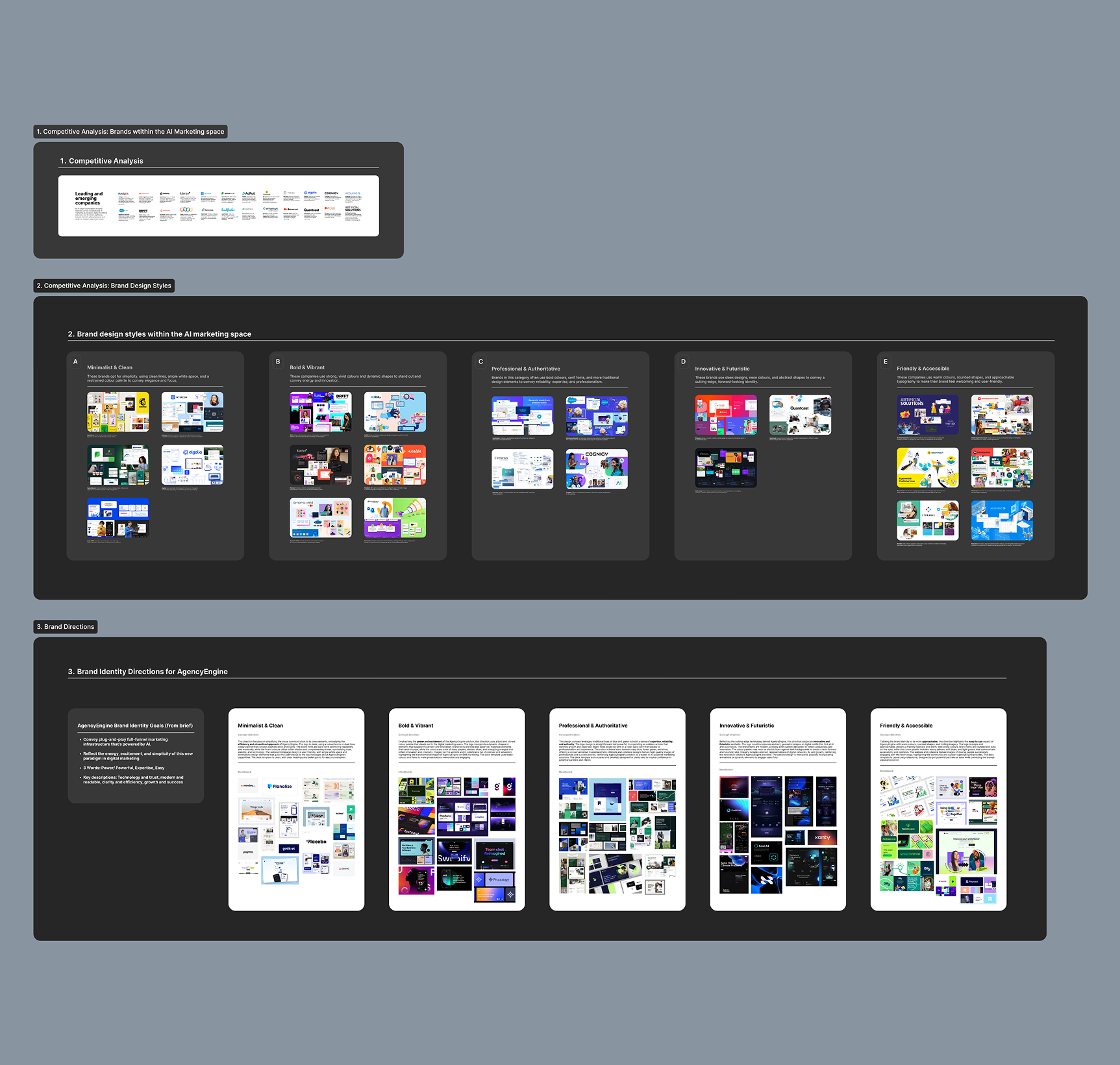
Competitive analysis and early brand direction studies
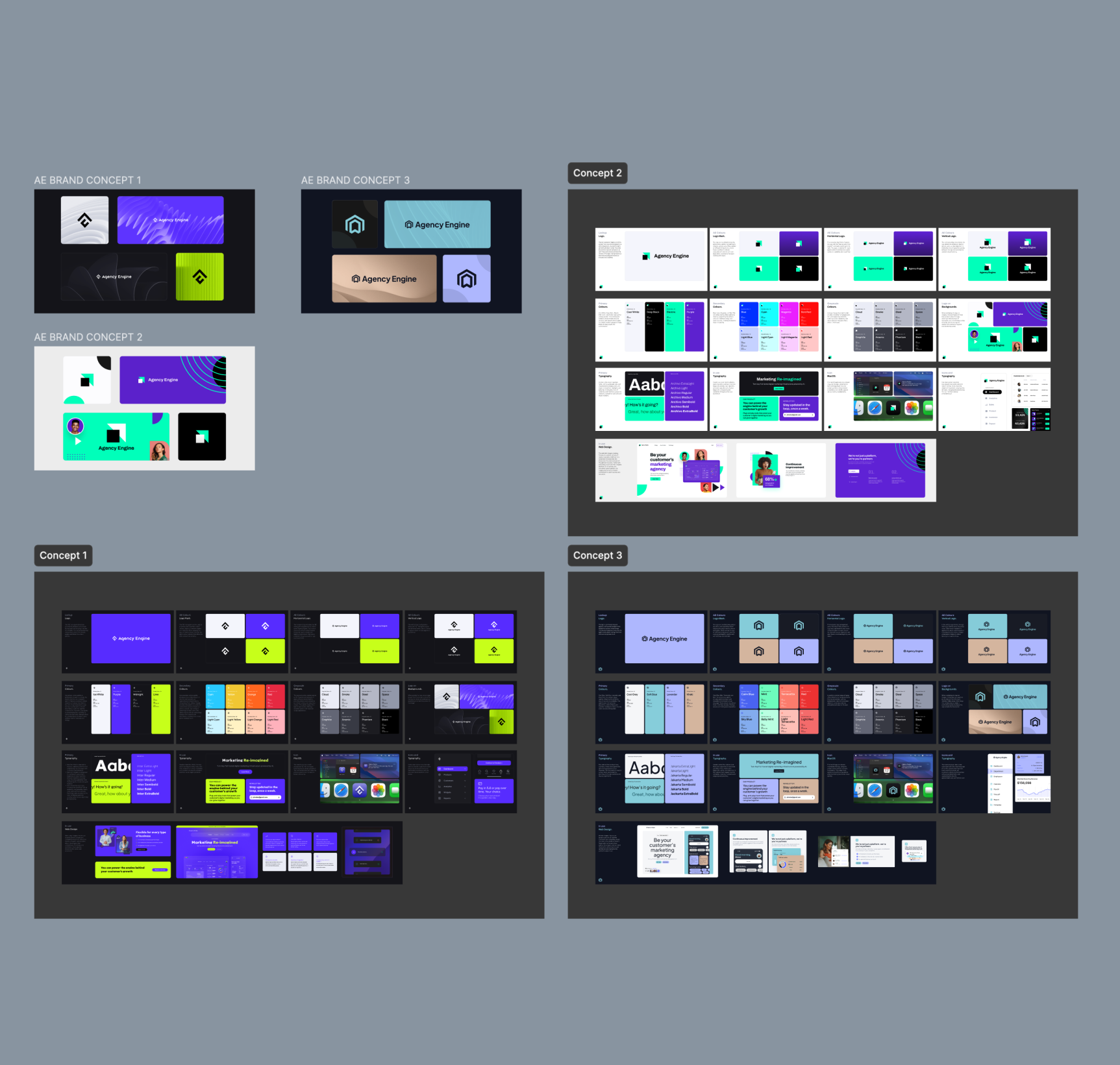
Designing 3 proposed concepts
Exploring Brand Directions
To translate AgencyEngine’s goals into a clear identity, I began by grounding the work in their brief: a brand that conveys powerful, plug-and-play marketing infrastructure driven by AI, while feeling modern, trustworthy, and easy to use. From there, I mapped five potential directions: minimalist and clean, bold and vibrant, professional and authoritative, innovative and futuristic, and friendly and accessible. I supported each with competitor moodboards to show how they could live in the market. After consultation, we narrowed the focus to three directions for deeper exploration: bold and vibrant, minimalist and clean, and friendly and accessible.
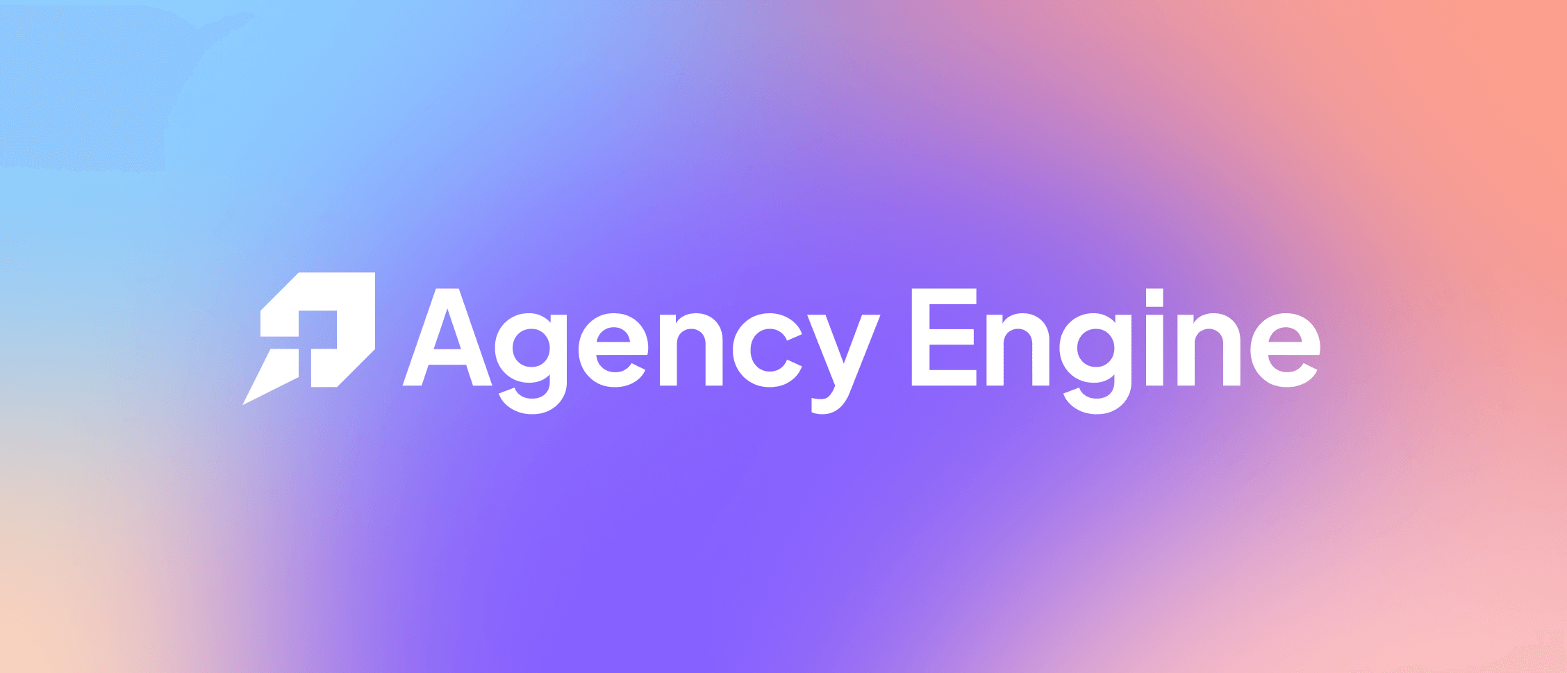
Final logo design created for Agency Engine’s brand identity
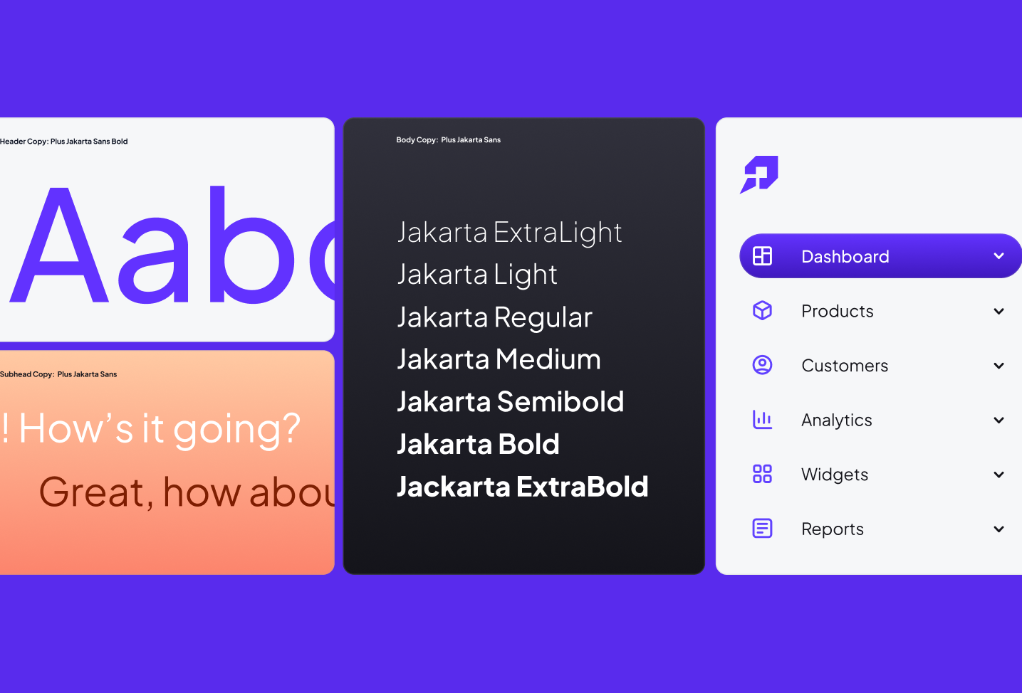
Visual system elements showcasing the brand’s bold, approachable direction
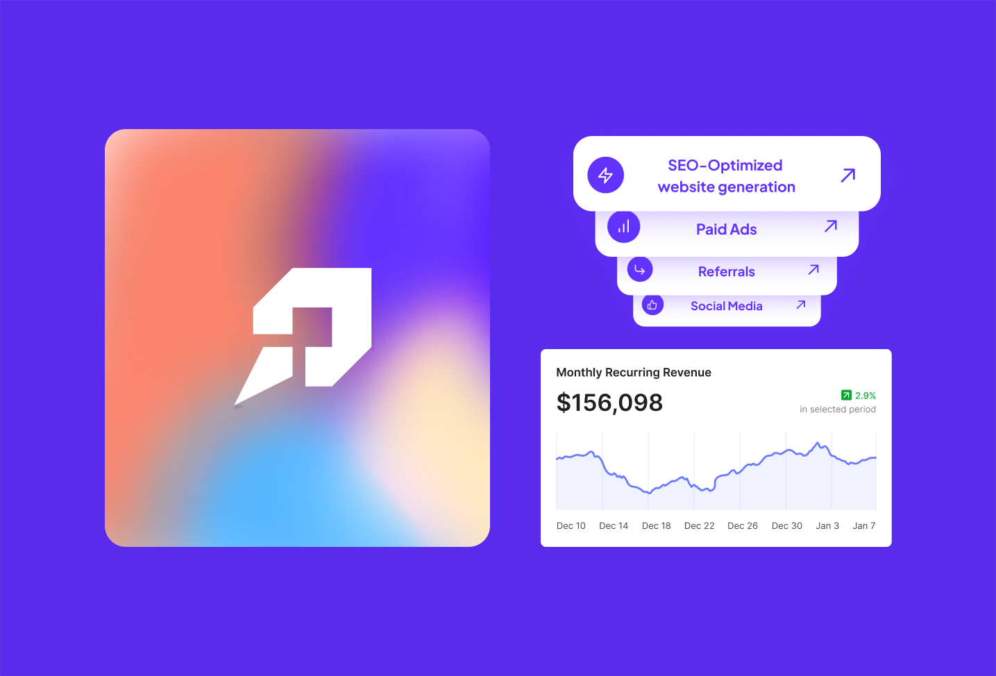
Reusable UI components built to give the team a scalable design system
Blending Boldness with Approachability
After reviewing the initial concepts, the AgencyEngine team gravitated toward a hybrid direction that combined the energy of “bold and vibrant” with the warmth of “friendly and accessible.” This blend struck the right balance: confident and modern, but still approachable and easy to connect with. The identity we moved forward with leaned into high-contrast colors, dynamic typography, and clear design systems while keeping a tone that felt human and inviting. The result was a visual language that captured both their technological edge and their accessible, partnership-driven ethos.
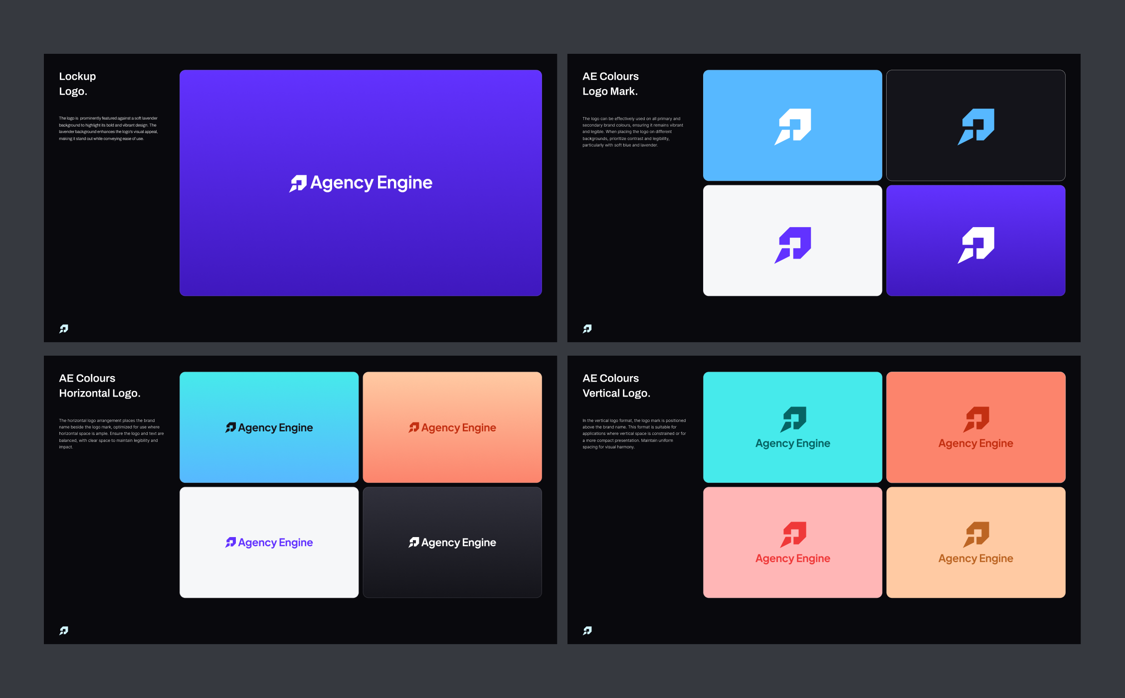
Brand identity guidelines detailing logo usage and construction
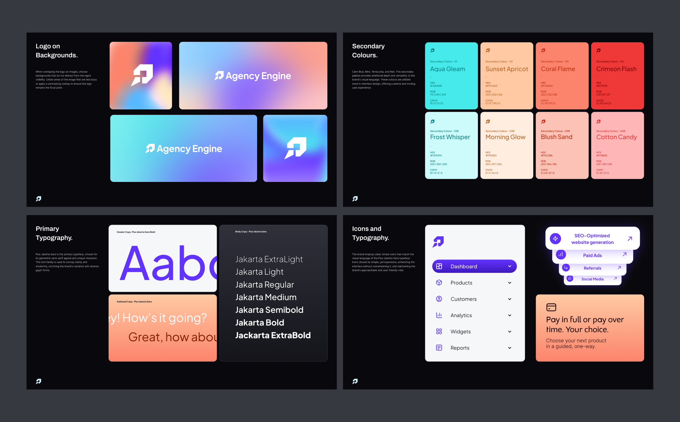
Style guide pages defining color palette, iconography, and primary typography
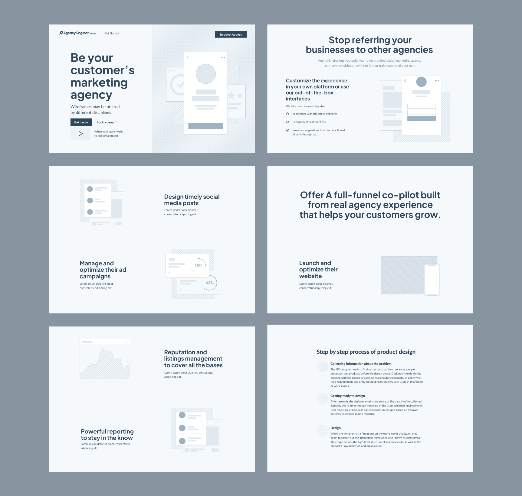
Website wireframes shaping structure and flow
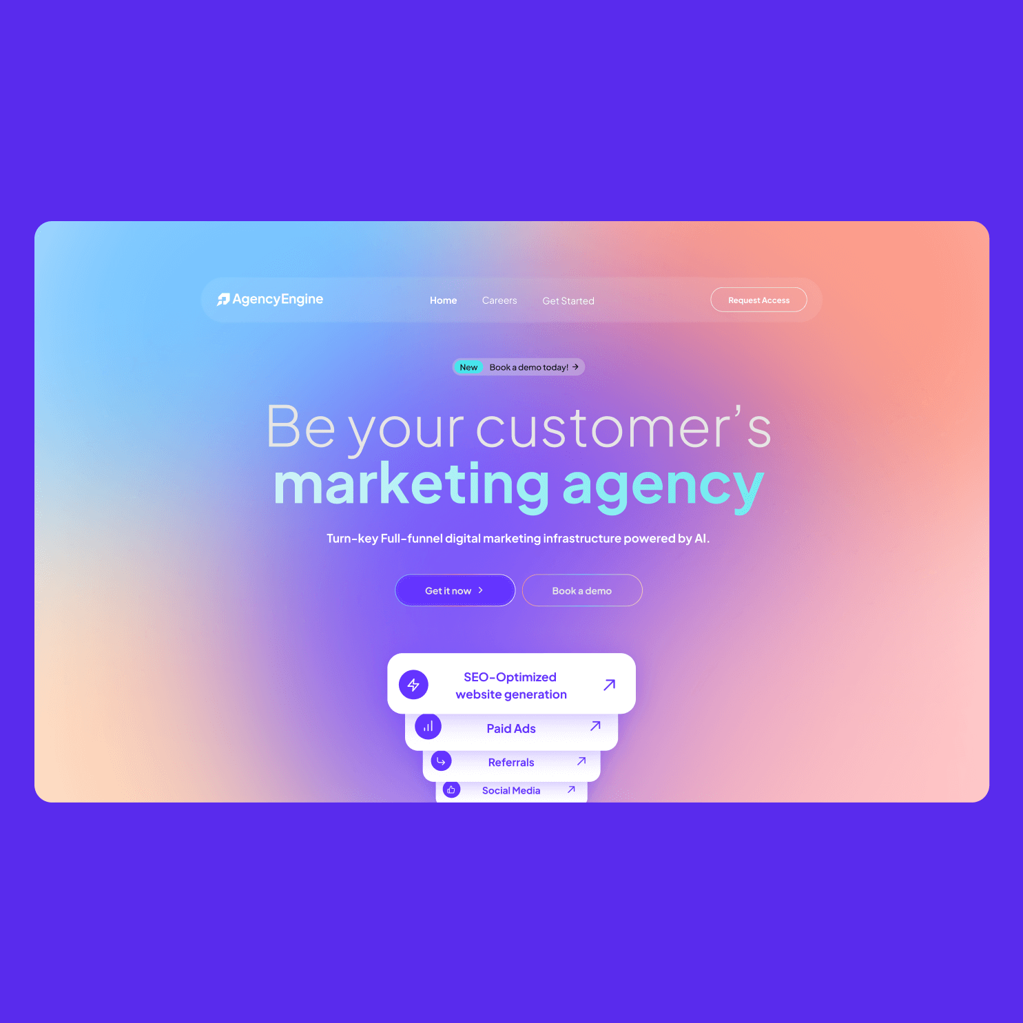
Desktop hero design for AgencyEngine
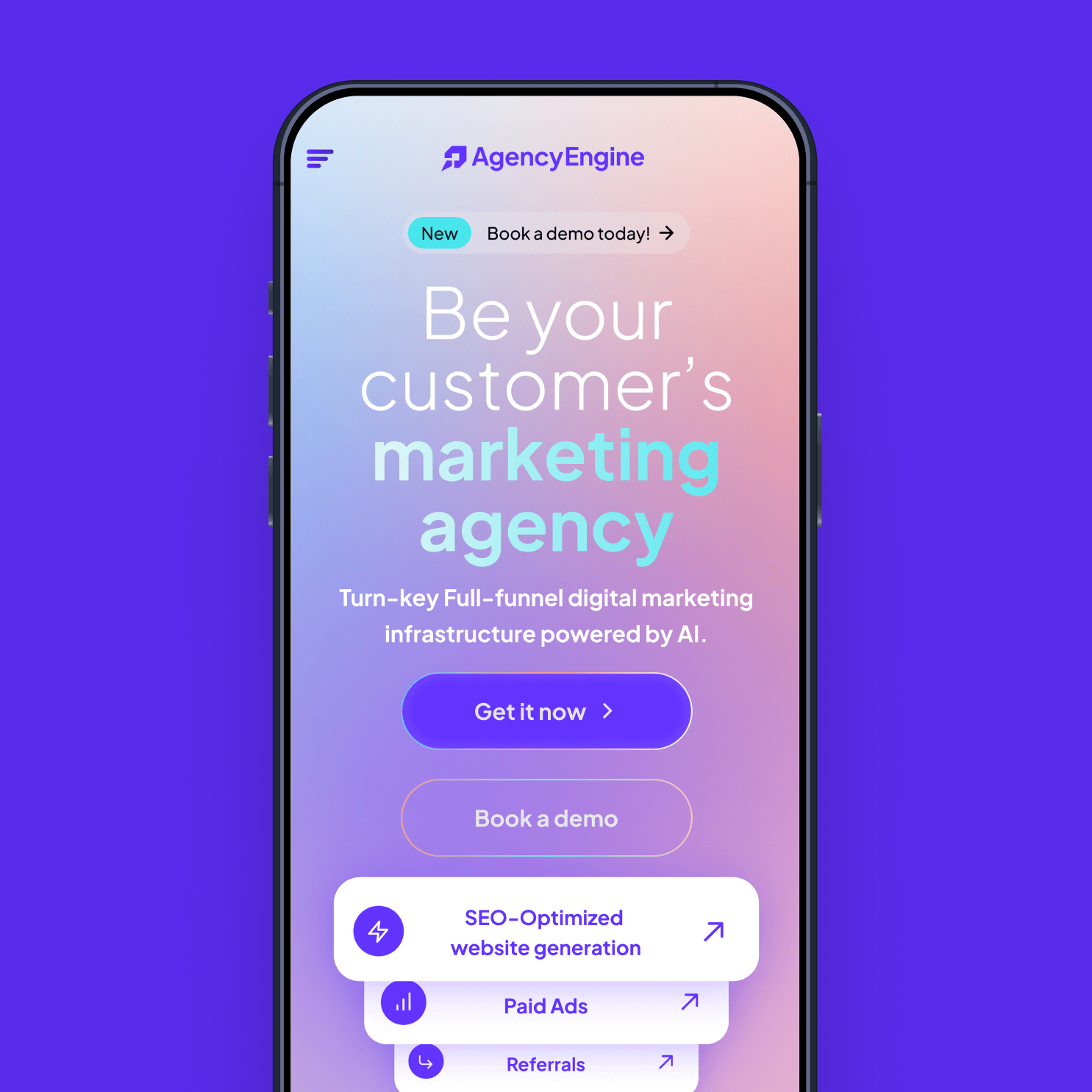
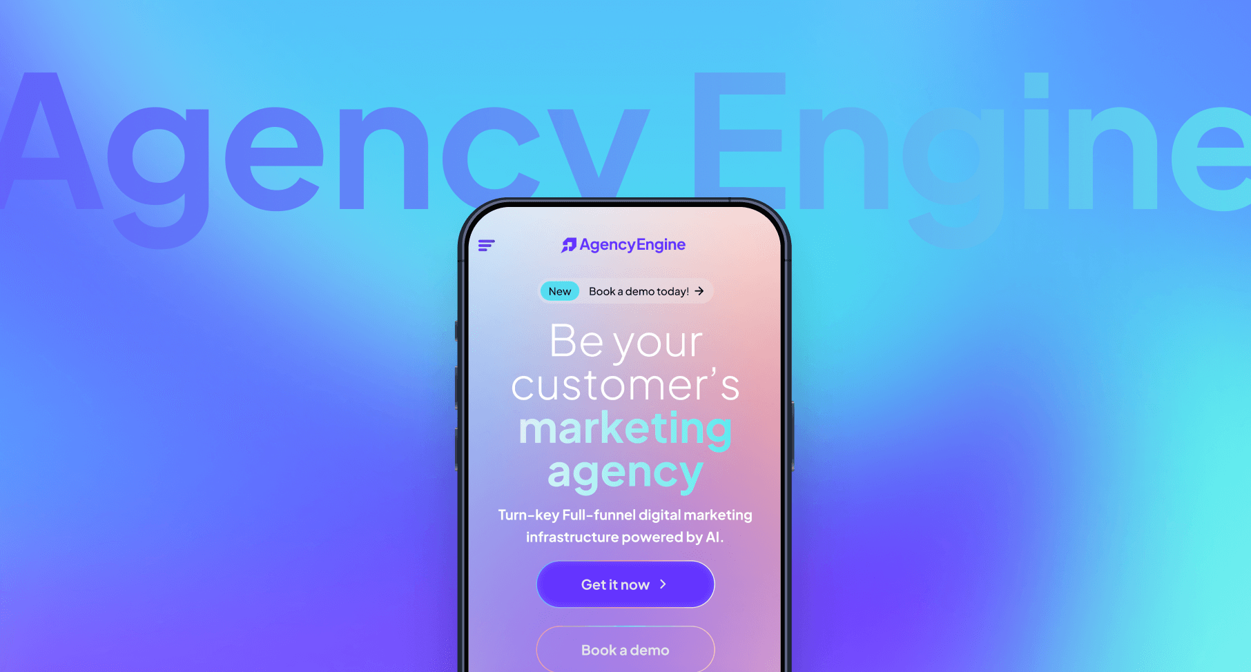
Mobile hero design for Agency Engine
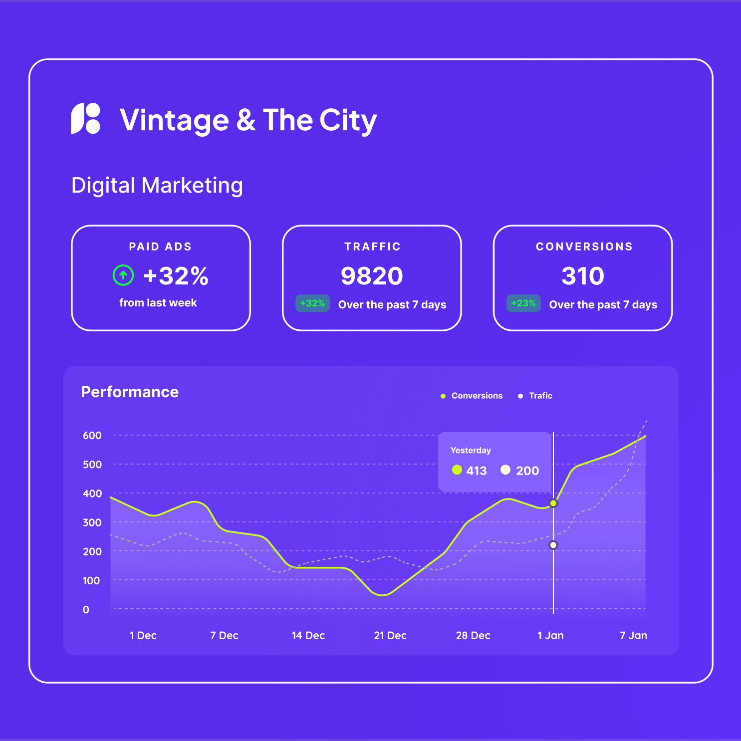
Landing page component from design system
Setting the Foundation for Growth
To make sure the brand could scale seamlessly, I created a detailed design style guide alongside a full Figma file. Every element was set up with care, from typography rules to color palettes and pre-made components. The goal was simple: when an in-house designer opened the file, they could get to work immediately without reinventing the wheel. Everything was built, organized, and ready to go, giving the team a solid foundation to expand their brand with consistency and speed.
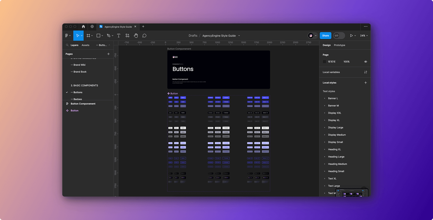
Design System: Basic Components
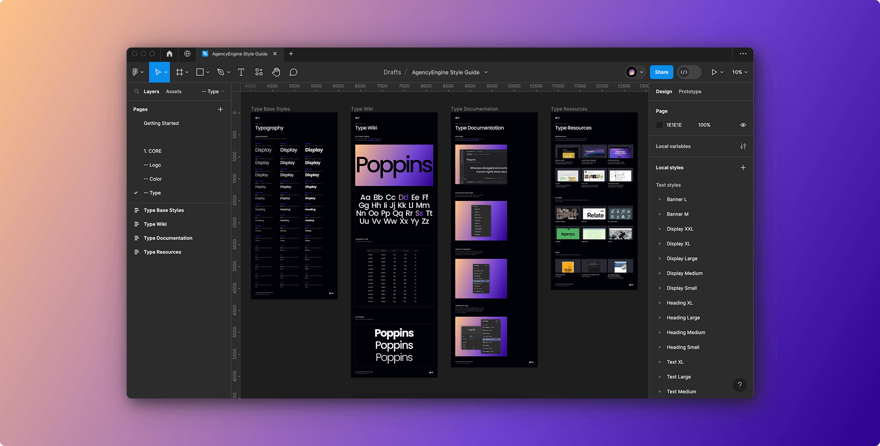
Design System: Core Brand Elements
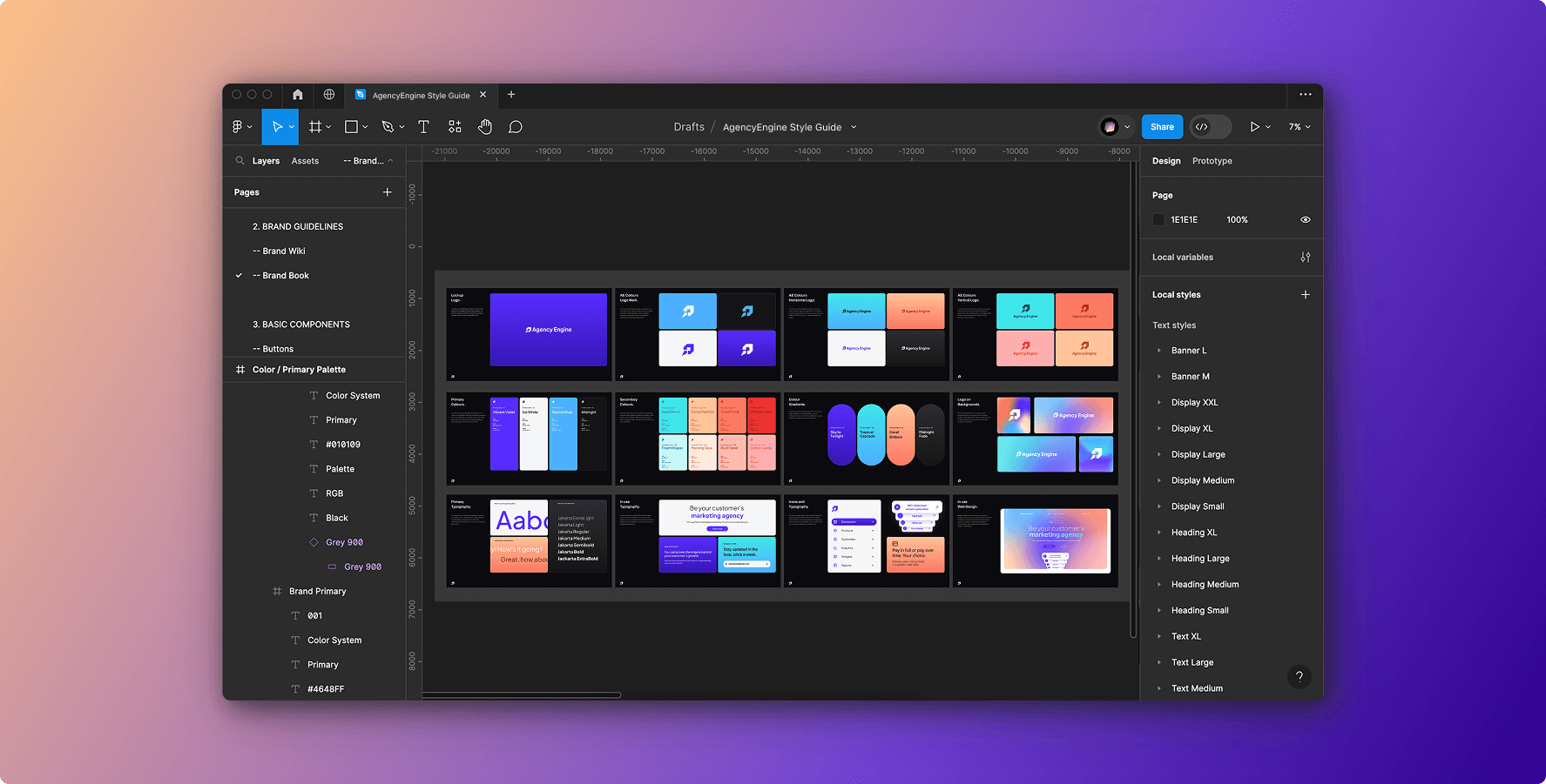
Design System: Brand Guidlines
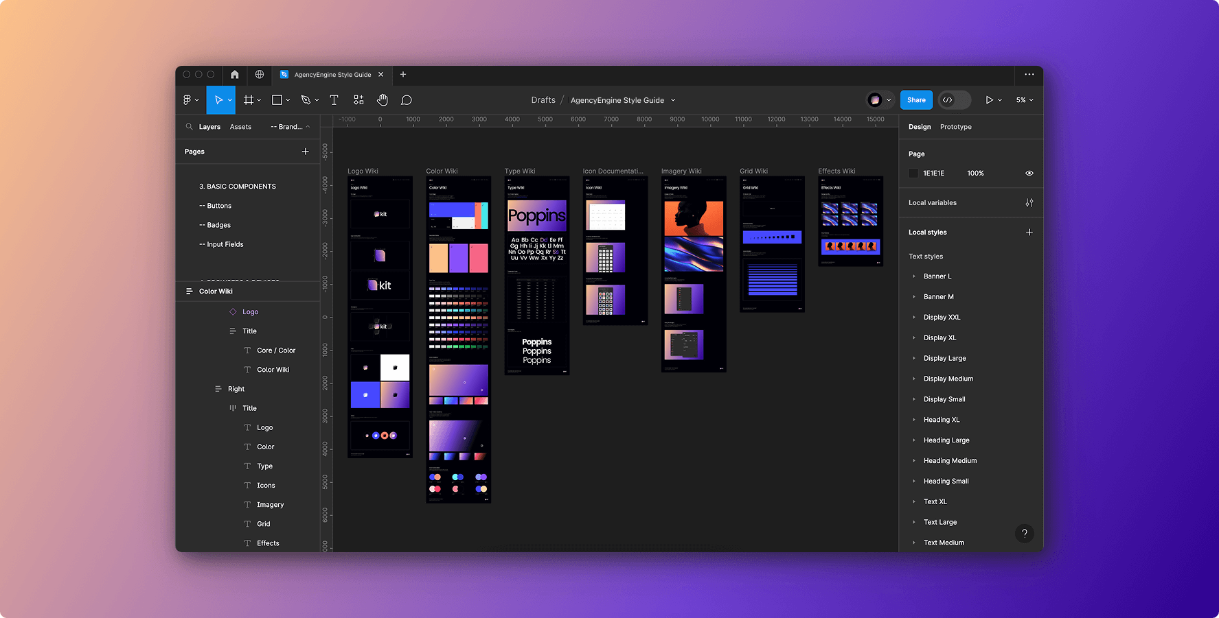
Design System: Brand Guidlines
Building the Design System
After finalizing the brand identity, I worked closely with the client to shape their website direction. Starting with wireframes, we collaborated directly on structure and flow, making sure the experience reflected both their business goals and user needs. From there, I built a full Figma file with a web-focused design system, complete with reusable components, grids, and responsive patterns. The site was designed to be developer-ready, with every detail from spacing rules to interaction states documented and handed off in a way their in-house dev team could immediately pick up and build. By delivering both clarity and flexibility, I gave them a foundation they could scale confidently over time.
© 2026 Eric Mok - Product Design Lead. All rights are reserved.